How to make a chart, line, pie chart, bar, graph, etc. in Google sheets? Do you want to learn how to make bar graphs or charts at ease on Google sheets? Does that ever occur to you how convenient it is to have access to the Google sheets? Well, we are here to help you with that with our step by step guidance on how to use Google sheets covering topics like, how to make a bar graph, a graph, line graph, pie chart, radar chart on Google sheets, etc. So, let’s dive into this fun-filled informative article to widen our horizons and learn about the Google sheets.
What is Google Sheets?
Well, Google sheets is a purely web-based, free, cloud-based spreadsheet application that works under Google’s services, providing benefits under the Google Drive services. The application is widely used all over the world. It has various extensions along with multiple platforms as it is available as a desktop application on ChromeOS, and as a mobile application on android devices, Windows systems, iOS, and BlackBerry. The root of this branch, Google Drive, also hosts other super amazing drive-based products such as Google Docs, Google Slides, and Google Forms.
What is the purpose of Google Sheets?
The purpose of Google Sheets is to make your life way more comfortable than before, especially if you are a college-going student; this is like a golden vessel. So Google Sheets allows its users to organize, edit, and analyze all sorts, types, and varieties of information in a way that makes your work more efficient and organized, serving it’s the best purpose. Apart from that, it also allows collaborations, and multiple users have access to edit and format files in real-time. Another very striking plus point is that any changes made to the spreadsheet can be tracked by a revision history very easily.
Features of Google Sheets include:-
- Editing
- Explore
- Supported file formats
- Easy and accessible offline editing
- Integration with other Google products
How to use Google Sheets
As we already know that Google Sheets is a user friendly, free application that can be used on the chrome web browser or the Google Sheets application on the Android device or iOS platform. To start with, users or workers need a free Google account. To create a new Excel Sheet, you need to follow the given steps:
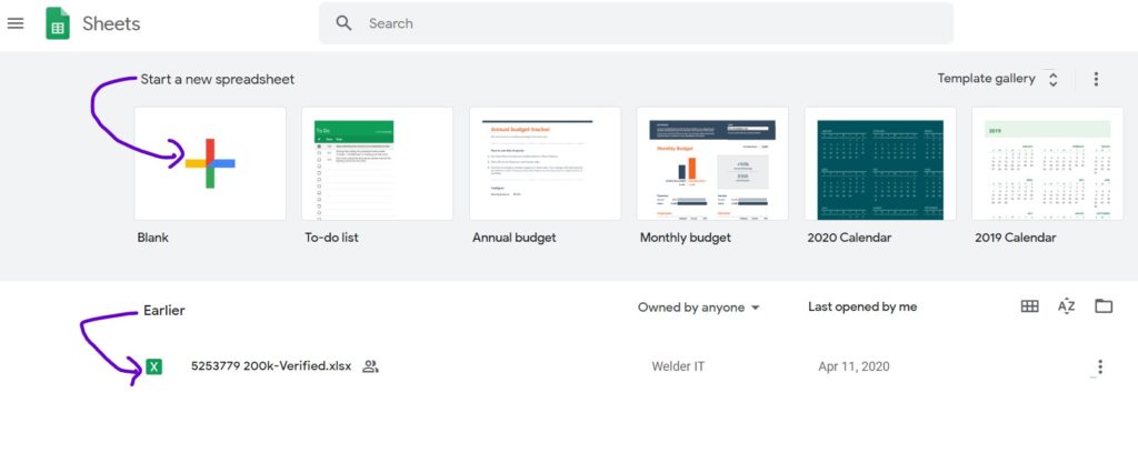
- Open the Google Drive dashboard, and click on the “new” button present on the top left corner of the page, and select Google Sheets.
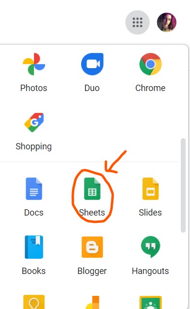
- Another method to open: click on “6-dots menu,” Scroll down, you will see “Sheets app,” Click to open.
- Open the menu bar on the spreadsheet window and go to File, and after that, click on New. This step will create a blank spreadsheet window, and your page will look something like the below image.
How to make a bar graph on Google sheet
One of the most daunting features of Google Sheets is that even though it is primarily a spreadsheet tool that is used to enter and store data, it is not just limited to that. And that’s where graphs and charts in Google Sheet come in light. Bar graphs help in better understanding and easy visualization, creating more space for imagination. They are a way more creative outlook for the attainment of knowledge than the monotonous excel sheets.
The following steps demonstrate how you can create a bar graph in Google Sheets based on any data set that you might have entered:
- Write any data-set on the excel spreadsheet of the Google Sheets product of Google Drive as per your need.
- Select the data-set and don’t forget to include the headers.
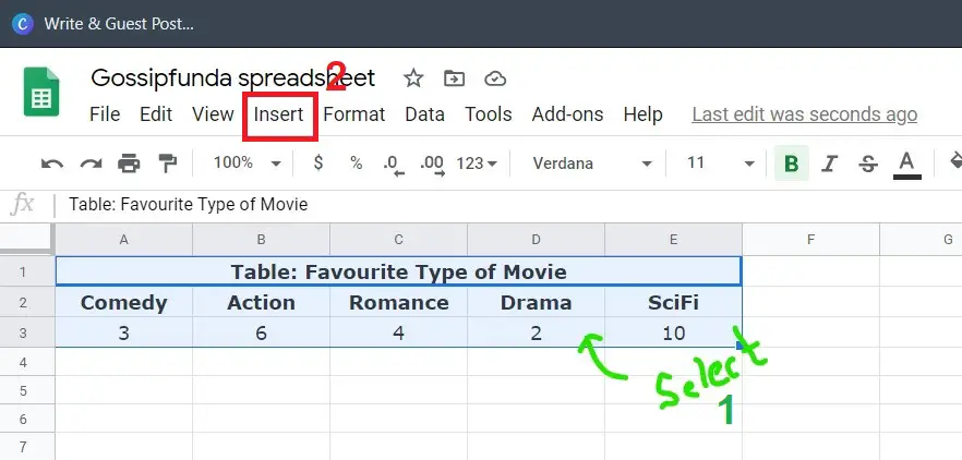
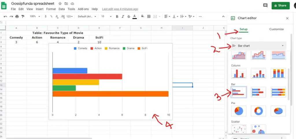
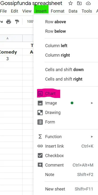
- Now, in the toolbar area, you will see the “insert chart” icon. Now click on that “insert charts” icon. Doing that will insert a suggested chart in the worksheet. 4th option after “File.”
- You can click on the setup->select chart type->In bar graph option choose one from “Bar chart/Stacked bar chart/100% stacked bar chart“and voila! You have it.
How to make a graph in Google sheets
Well, making a graph in Google Sheets is one of the most creative yet easy tasks of all time. The Google Sheets give you numerous options for your graph so that things are always convenient and work as you need them to.
So after you have entered the required data that you might wanna turn into a graph in Google Sheets, you may want to create a visualization of that noted information to make it more appealing to you.
So here’s a step-by-step guide on how to make a graph in Google Sheets:
- Collect the data and write down the information you want to display a graph. Select all the cells with information that you wish to show in the graph.
- There’s an “insert” option on the toolbar. Click on it.
- Now you will see a suggested worksheet where you will see the “chart” icon. Click on that, and you have all sorts of graphs that you wish to use for the best representation.
- In Setup, click on the “chart types” for options, including switching what appears in rows and columns or other kinds of graphs.
- You can also click on customization for additional formatting options that might suit your type.
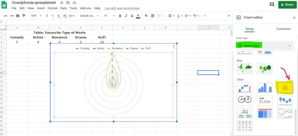
- Click on “Graph” which you want to insert. Choose from list: Line/area/coulmn/bar/pie/scatter/map/other. For example: Radar chart graph
- And yay! You have a graph in your Google Sheets spreadsheet.
How to make a line graph on Google sheets
The line charts or line graphs are easily the most effective and important of all the charts available in Google Sheet or elsewhere. The use of these line charts varies greatly. It is greatly known for segregating data efficiently to signify data trends over time.
Even though it is useful in the majority of business firms and companies, if you are looking for something such as the rise in your business over the years or want to calculate the number of people that got unemployed over seven months, line graphs are the best for you.
Google Sheets helps you with all that intricate stuff that you got to know, and with Google Sheets, you won’t need to mug it up anymore. In the following guide, we give you a step by step tutorial on drawing or inserting a line graph on your Google Sheets spreadsheet.
- Open Google Sheets and write all that data that you need to represent in a line graph on the spreadsheet. It can be any information that you would like to see in a more visualized and creative manner.
- Now that you have a dataset to work on, select the entire tables, that is, the cells of the rows and columns, and then go to the top menu.
- You will see an “insert” icon there. Click on the “insert” icon and then click on “chart.”
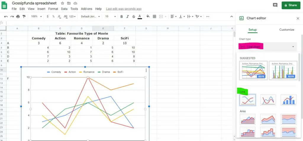
- When you see the “chart editor” dialogue box, click on the “chart type” icon and then click “line chart.” You will see a collection of line charts: Line chart/smooth line chart/combo line chart.
- Google sheets will select the most appropriate line chart from that collection based on your range and data. Yeah, it is kinda smart.
And, so yeah, there you go with your line chart. However, you can always customize it if you are not satisfied with the results.
How to make a pie chart on Google sheets
We learned how to make all the different types of bar graphs/charts, and its time for the best of em all. Yes, pie charts are the best form of visual representation because of their creative approach and mind-stimulating outlook.
The one thing that you need to keep in mind is that you have to first sign up for a google account to be able to use Google Sheets. So, for that, you just gotta search for Google Sheets on chrome, or if you have it on your desktop, then open it through that. Follow the following step-by-step tutorial to get further insight on how to make a pie chart on Google Sheets.
- Type the data that you wish to represent as a pie chart on the spreadsheet.
- Now, select all the written dataset along with the titles.
- On the top menu, you will see the “insert” icon, click that and then open the chart editor.
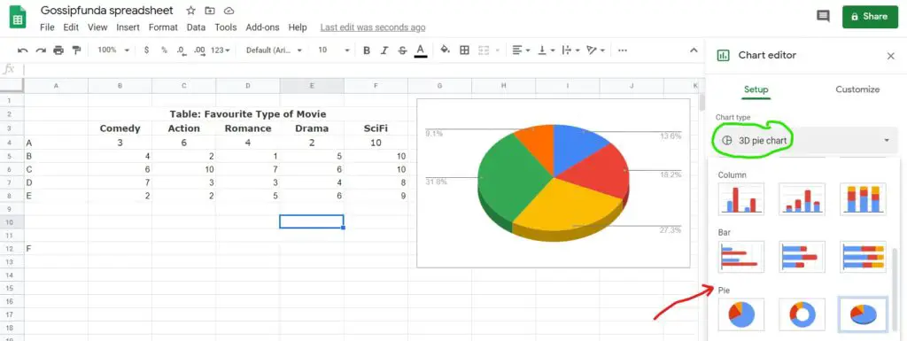
- You will get a collection of pie charts after clicking that. Now, you can select the type of pie chart: Pie chart/Doughunt pie chart/3D pie chart, that you like from the menu. Normally, a suitable pie chart matching the dataset appears on the spreadsheet due to the intellectual capacity of Google Sheets.
- However, you can always customize the type of pie chart that suits your vibe. After all, it’s all about your interests and understanding.
So, that was how you design a pie chart on the spreadsheet of Google Sheets.
Conclusion
In the above article, we tried to give our best on how to use, make, or design different types of graphs and charts on the spreadsheet of Google Sheets. Google Sheets does not only give proper outlay for data but also provides its users with the option of editing and customizing their data more creatively and enthusiastically. To understand the intricacies of Google Sheets is not that easy unless and until you have got great mentors ho help you understand terms in the easiest way possible. We hope that we were able to transfer that information to you in a natural way.

My name is Shubhra, and I go by SPM. I have been writing since the tender age of 13 and have a professional experience of 2 years in technical content writing as a freelancer. I believe that persistence, faith, love, and motivation rises from within to lead you towards what your soul desires; hence, I have always embraced my burning passion for writing since the very beginning. I’m very outgoing, intense, and lively—basically, a paradox, living her life to the fullest while preaching self-love and spreading love.